Choose a New Home Office Colour Scheme

If you are wondering how to create a new office design, then you should start by picking a colour. Choosing a new colour can make all the difference when looking to freshen up an office design. We have put together some more top tips to help you make the most of your space and choose the right office colour scheme for you.
Colour theory applied to office furniture can be as simple as adding colour to a room furnished with white bench desks or adding colourful pieces to cheer a room up.
In this guide to home office colour schemes, we’ll walk you through a variety of ways you can bring colour and new life into your space.
Visualisation workout: a way to dream your office into reality
Imagine you are walking around your ideal home office, looking around. Stop to feel the fabric of your chair as you sit at your dream desk, hear the tapping of keyboard or the scrape of a pen as you work away. Smell the fresh scent of your favourite reed diffuser or admire your potted cactus. What colours do you see? What feelings do you have?
Taking part in this visualisation exercise can help you conjure the image of your dream office, helping you decide what design and colour scheme to work towards.
Top tip: creating movement and sensory cues when visualising can help the image become more real.
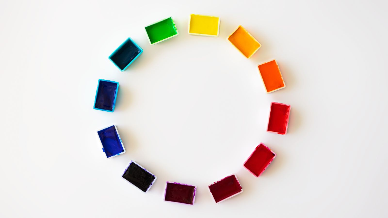
Use the colour wheel to choose your office furniture
Sir Isaac Newton designed the first circular colour wheel in 1666. Variations on the theme have been drawn up ever since. Today, we have some simple plans that are easy to follow. Colour is a nice way to contrast white furniture, which looks cool, crisp and clean in an office, but may, of itself, feel too clinical for everyday office use.
Well-being is so important in the workplace. A sterile environment may create unease and boredom in those who have to work there, so the colour is a healing answer to the need to have order and cleanliness and at the same time a comfortable working environment.
Primary colours make bold furniture statements
The film ‘Primary Colours’ may seem to have no bearing on this theory, but if you take a lot of different stories or colours and blend them together to form a bold, striking picture you may find that however complex the mixture, they pare down to simple truths or the primary colours and the essence of human frailty, valour and humanity. The Film is about the Primaries in the US, but the double meaning of the title belies a simple truth. An office may be filled with many parts, different items of furniture, and different areas for different needs, but somehow these disparate parts can be drawn together with the use of colour.
You could use a colour scheme, a theme per area, or even a chaotic blend of every colour under the sun. But all these colours have their origin in primary colours, or so current colour theory may suggest. Everything through the root of the complexity comes back down to simple ingredients or primary colours. These are the only three colours that cannot be formed by mixing any other colour and are thought to be the basis of all colours.
The Primary colour wheel consists of red, yellow and blue. These are the colours that you first learn to paint with as a child if you go to a Rudolf Steiner School. From these three colours, you can create other colours. Red and yellow mixed create orange; blue and yellow create green; blue and red blend to purple, and red, yellow and a hint of blue create various hues of brown.
From the three colours blended in various amounts, you can mix the colours of wood. If you want to use wood in your new office, painting the colour of a wood finish can be a start. Then look and see if there are more red colours like mahogany or cedar, blue in silvery grey in Indian Silver-Grey Wood or yellow shades such as pine or pale oak in the finish. You can then pick up these shades in your fabric and wall colour choices.
Two primary colours, a secondary mix for your office furniture
Red, yellow and blue may be where colour truly begins. When you mix one primary with one other primary colour in equal quantities, you create a secondary colour. It’s not rocket science, it is simply one plus one equals two, the second note in a scale, the second colour on the colour scale.
It can be nice to use primary and secondary colours when choosing your office furniture to create a bold colour statement on a plain canvas of white walls and white office desks, for example. The secondary colours are orange, green and purple. These are great colours for adding accents to a room, colours that pick up hints of other colours or offset blander colours, such as setting purple against grey, green against black or orange against cream.
Tertiary colours: creating instability in your furniture
Tertiary colours may come in different hues depending on how much of colour one and two you mix together. They are secondary colours mixed in unequal amounts to create further variations of colour. Yellow-orange or red-orange; red-purple or blue-purple; blue-green or yellow-green. The subtle shift in shade can be beneficial for choosing your colour design. If your greens are yellow-green, like spring leaves, you can choose yellowish colours to work with the hue. This is a useful device to learn and easy to put into practice. Some colours may look good together and supposedly not match, whilst others may clash and grate, simply not working in harmony.
Colour harmony for your office chairs
“Weave us together in harmony and love,” as the hymn goes. Harmony is a happy blending of music, poetry, motion or colour. It is things working well together, symbiotic relationships and symphony.
When looking at harmony in terms of colour, we see colours that work, that interest us, that we like. At the two opposite ends of the scale are dull, boring, lifeless, nothingy colours or bold, clashing, garish, inharmonious combinations. Colour harmony is a balance of visual stimulation and order in chaos. In music, it may be the quarter tones that we resonate with the in-between notes rather than the full-on primary notes, which carry the tune. In furniture, it may be nice to blend and contrast colours to create unexpected interest and harmony where we don’t expect it. You can add colour with chairs to create accents to a plain office canvas.
Colour contrast can create harmony in furnishings
Colours that sit juxtaposed, either side by side or at opposite ends of the circle on a twelve-colour wheel, may create harmony in their opposition. For example, purple and red, which sit next to each other or green and red, which are directly opposite. Some other nice colour contrasts might be orange and pink, which should clash, or orange and purple. Be bold and try throwing different colour combinations together and see what you come up with.
Set the mood with colour
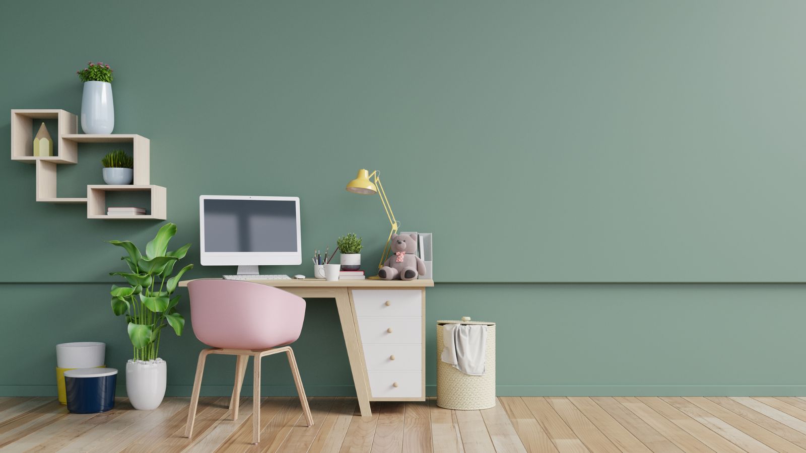
Colour can be creative, wild, calm, relaxing, emotive, volatile or neutral. If you have a vibrant, creative business, you may want to keep your overall office in neutral colours, perhaps add a hint of colour here and there, but not distract your creative mind with a chaos of colours. Opt for neutrals, smooth surfaces, and plain colours. White can be nice, but if you want something a little warmer, then look at wood finishes to bring you the gentle comfort of nature.
Your office may be vast and cavernous, in which case, bold statement patterns of colour may break up the expanse and bring some sense of balance to a room. However, if you’re working with a smaller space, simple white can make it feel bigger.
You may seek calm and colour, for example, if you work with children, so spring green or lilac may add colour in contrast to white walls and wooden or white-topped desks. A party space for an events office might go down the light, bright and stylish pastel route or the dark, black, purple and silver cool youth culture line.
Colour may evoke very different feelings. How it is used can also change everything. A plain room with a lime green musical motif in light lines flowing around the room may lift, whereas red and black with playing card pictures might be very intense and difficult to work in every day. Think carefully about your office colours and use of colour. You can always paint a blank canvas and add colour through pictures, pieces of furniture and cushions, which you can change as your needs change.
Cut and paste your dreams into reality
Whether you are thinking about your own home office or planning a larger-scale refit, it can help to look at pictures online or cut them out of magazines to draw inspiration. If it is a workplace where there are lots of people, you could pin up a collective vision board and let everyone add something using blue tack or a pin so you can move things around until it looks right for everyone.
Tip: Write down what you want and imagine how it will look as you walk around.
What do I do with my old furniture?
Sell it, give it to charity, upcycle or recycle it. Saving costs and the planet while you refit is a great way to avoid adding to landfills and feel good at the same time. Through office furniture recycling, we will buy and clear your old furniture, which is more environmentally friendly than simply disposing of it.
So what now? You have a vision of the best office for you, make it a reality; contact CK Office Furniture today!
CK Office Furniture has it covered. We can buy your old office furniture, or if it is not resellable, we work with a number of charities who would love to benefit from your donated furniture.
Share your dream office!!
Share your vision, send us a photo of your dream office board and tell us what inspires you. You can email us via info@ckofficefurniture.co.uk
Tip: Call us today on: 01892832880 or email: with images of your unwanted furniture, with quantity and location to info@ckofficefurniture.co.uk